Kingsland Preschool: website makeover & more
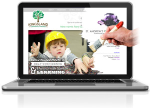
Rebranding a trusted community preschool with a new name and location
Kingsland Community Preschool is a cooperative preschool based in Calgary, Alberta. The school, formerly known as St. Andrew’s Preschool, had moved to a new location and also underwent a name change. Their Reggio Emillia inspired play-based program formed the basis of the curriculum for the last 40+ years.
The Challenge
The challenge of this rebrand was to build on the strengths and brand value of the St. Andrew’s Preschool, while transitioning to a new name and location. The preschool needed to promote this big change with positive messaging new branding and promotional tools.
The previous website was limited in scope, with a simple page structure.
The design needed a major overhaul: the vibe of the site was more artsy than kid-friendly. The font was small and hard to read. The site also needed to be optimized for local search.
Organizations like Kingsland Community Preschool have a unique branding challenge: they need to portray a kid-friendly environment, while at the same time project a professional image that will appeal to parents. For the new site, we opted for a playful, fun look and feel, that would also be professional and easy for parents to navigate.
To start with this task, we evaluated the existing site, and researched the local preschool market and websites. Creating a new logo and brand identity was the first priority, with the website and other promotional materials to follow.
The goals for the new website included:
- Build trust and credibility with parents
- Provide a central hub for registration and other related documents
- Distinctive branding in order to stand out in the marketplace
- Clear and easy navigation
- Local SEO targeting
The Concept: “New name. New location. Same great preschool.”
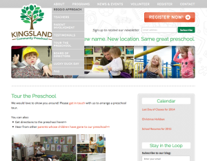
Whimsical graphics set the stage for an inviting, child-friendly format. The logo of the tree represents the nature-driven philosophy of the preschool, growth and a symbol of strength. The navigation menu in grey was positioned at the top of the page for easy viewing, and is broken down by important categories: About, Programs, News & Events, Volunteer, Register, and Contact.
Pictures of children are situated beneath the logo in a slideshow format and under the school’s tagline: “New name. New location. Same great preschool.” The font is clean, large, and easy to read. Fonts used on some of the photos take a more playful, whimsical approach.
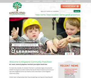
The color palettes for the new site include green, orange, grey, brown, and white to reflect the focus on nature and philosophy of the preschool. The orange and green colors are used throughout the site for the call to action buttons, such as subscribing to the school newsletter and registering for enrollment.
The Programs section provides an easy way for parents to see what is offered by Kingsland Community Preschool.
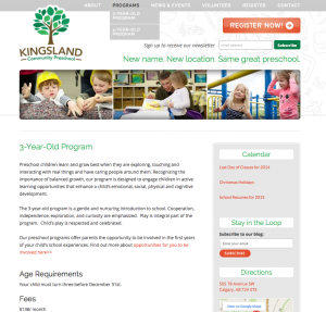
You can also easily see that there is a blog with recent news and updates about the school on the homepage, shown to the right of the slideshow with a Recent News box.
A sitemap is located at the bottom of each page, in addition to a calendar and contact information: important, accessible information.
User Experience
It was important to make the site user-friendly for parents, who are looking for specific information when seeking a preschool for their children. The site was built to be very simple — navigation menu at the top provides drop down menus with information on things such as Registration and Programs.
The News & Events tab offers a blog that highlights the latest happenings at the preschool.
The About section offers a lot of information for inquiring parents, including a FAQ page.
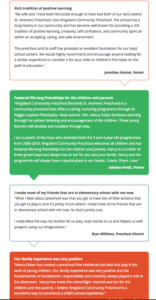
The Testimonials page lists feedback from parents (and even some alumni!) in a nice, easy to read format through colorful call-out boxes.
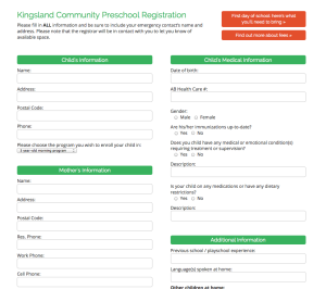
One of the most important features of the site is the ability to register new students. Rather than download a PDF to fill out, parents can easily get their child registered and submit the information online by clicking on the easy to find Register button at the top or by clicking on the Register tab on the navigation menu.
The Result
The preschool has been pleased with the results! Parents have given positive feedback about the site, saying it was appealing and easy to navigate. The site addressed several needs:
- Improved design and usability
- Incorporated new preschool branding
- Optimized for local search
- Comprehensive and informative
Take a tour of the new Kingsland Community Preschool website by clicking here>>
And learn more about website makeover services here>>
