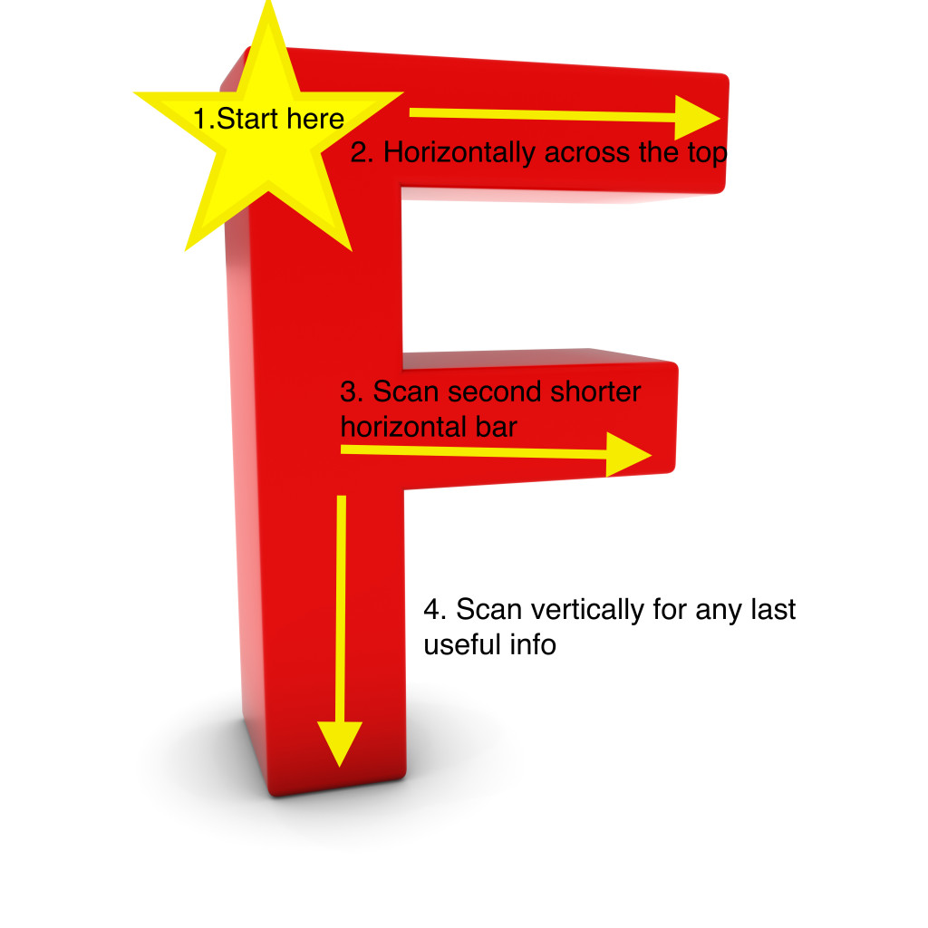
F is for fast when it comes to writing for the web
As the old adage goes, if a tree falls in the forest, does it make a sound?
The same can be said for your web content. The best copywriting on the web is meaningless if no one reads it.
Studies on how quickly people read–or don’t read–content on the web vary these days from 17 miliseconds to a few seconds (hours really in the online world). But one thing we know for sure, is you need to impress quickly or your potential readers will be gone.
Let’s talk (briefly) about the importance of the KISS principle when it comes to web content.
Tips for getting people to read your web content
F-Shaped Writing: Jakob Nielsen, Ph.D., known as guru of web usability tell us that F is for fast. “That’s how users read your precious content,” says Nielsen in his well-recognized study on eyetracking and reading on the web.
“In a few seconds, their eyes move at amazing speeds across your websites words in a pattern that’s very different from what you learned in school.”
Headlines, lists & short sentences
What does this mean when it comes to writing for the web? In short:
- The top left corner and headline are the most valuable areas of your page. Put your most meaningful content at the top.
- Headlines draw attention to content. Allow users to scan the page before diving in deeper to your content.
- Lists are best for keeping your reader focused rather than big blocks of text. Large paragraphs = eyes glaze, yawn, click to a different site.
- Short, active sentences and paragraphs are better than long ones. Make it easy for people to digest your message.
- Keep page content short and punchy. If you have more great information related to the subject, awesome! Split it out into secondary pages for those wanting more (plus it will keep them on your site longer).
- Use simple terms. Don’t make people figure out your industry jargon–or worse yet–acronyms. Talk in simple, friendly language.
- White space is good! Readers will understand your message if you leave out the clutter and use more white space. It helps the reader focus on your message–not all the “stuff” going on around it.
- Images are useful when it comes to connecting your message to your text. Big pictures attract more attention than small ones.
- Always include a call to action. Never leave your users hanging–always give direction where they can go next for more.
Key takeaway:
Always think “F” when writing your web content. Make it clear and simple with the most information at the top of the site, using headings, bulleted lists and finishing with one call-to-action.
Need help with writing (or re-writing) your web content?


